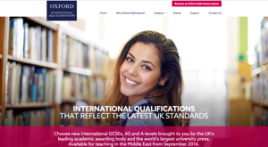
Oxford International AQA Examinations

I was the lead UX Architect on a high-profile project to produce a website for Oxford International AQA Examinations, a joint venture between Oxford University Press and AQA, to support the growing number of students studying at schools outside of the UK that teach a British curriculum.
This was a challenging project not only because of the tight timeline – the website needed to available by November 2015, when the joint venture was to be announced in Dubai – but because it involved collaboration with individuals who were working together for the first time, including external partners and third parties.
At the kick-off meeting for the project, we met with business stakeholders, including the project sponsor, to understand their vision for the joint venture and goals for the website. This progressed onto requirement gathering workshops, where I led the stakeholders through a process of eliciting requirements based on their business needs and desired outcomes. The project manager was new to website projects, so I led the discussions to ensure we covered all areas needing consideration.
We identified the target users at an early stage of the project: head teachers/principals (primary user), teachers/department heads, exams officers, ministries and exam bodies, and media. We adapted existing persona profiles to incorporate user needs and motivations for these user types, which we identified through user research conducted with our external partner, AQA. Additionally, we performed some competitor analysis to establish how we compare to others in the domain.
To aid our understanding of the users and their interactions with Oxford International AQA Examinations, I created a concept map to explore the mental models and clarify thoughts. These were shared with stakeholders to ensure that we were making no incorrect assumptions.
Working with the business analyst, I moved onto forming user stories and documenting key user journeys, which were presented to the business stakeholders for feedback and prioritising features and functionality.
Based on the agreed user journeys, I begun forming a site map document illustrating the site hierarchy, and run workshops to describe the site map and refine it. At this point we had explored a wide range of ideas and needed to scale back the volume of work for the target launch date, and used the site map and user stories to focus minds and define scope for the MVP, or initial phase.
As soon as we had agreement on what was to be built, I progressed onto sketching design concepts and wireframes. At this point I begun collaboration with a marketing consultant appointed to produce the marketing materials for the project (including all print materials), and we liaised on the direction we wanted to take the website. We also produced a content inventory to represent a complete list of the pages and resources that would be available on the website, including defining the most appropriate URL structures.
Since we didn’t have a dedicated designer or front end developer on the project, we sought out a design agency to work with to produce design assets and HTML templates. I partially managed the relationship with the design agency and was the main point of contact. I produced an interactive prototype using Axure to illustrate the desired interaction design, and authored a design brief and functional specification to communicate our expectations and requirements, and to ensure best practice was followed around areas such as accessibility and SEO.
I was responsible for collecting and communicating feedback from the business on design mock-ups provided by the design agency. To achieve this, I facilitated review workshops with business stakeholders, the marketing consultant, content editor, and development team.
Once we had business sign-off on the design, the work was handed over to the development team, who integrated the HTML templates with our CMS. I remained closely involved at this point to ensure quality of the website delivered, and identified issues before the website was presented to the business for testing and sign-off.
One notable omission from this project is usability testing. I had pressed hard to include this; however the project manager was concerned about hitting the target launch date, since everybody was already pushed to achieve this. This is one of the few projects I’ve been involved in where we haven’t conducted at least one round of user testing, and was highlighted as a risk to the business.
View next case study: OUP: English Language Teaching.